packaging
cohen's original jerk rub
Diecut Packaging Design
A premium label designed to hold its own on the shelf of an upscale grocery store. Hand-drawn botanicals rooted in Jamaican tradition, an earthy colour palette of beige, green, red and yellow, and a diecut oval revealing the actual spices inside. Every decision traces back to the story of what is in the jar.
Date
2024
skills
Adobe Illustrator, Adobe Photoshop, hand illustration, packaging design, diecut design, bilingual layout, typography, colour theory, print-ready file production


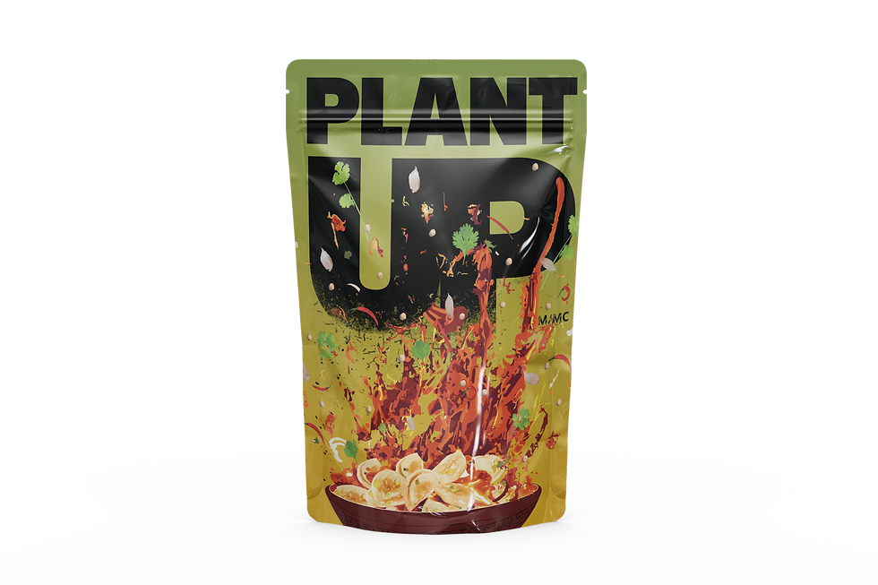
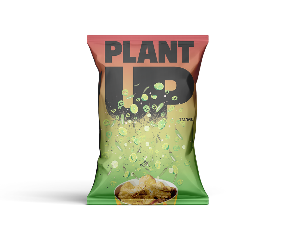
Plant up
Social Media Design
Packaging designed to stop someone mid-aisle. The bold logo anchors the top of the bag while ingredients explode upward from the product below, filling the composition with energy and flavour. Vibrant yellow, high-contrast typography and dynamic food illustration across chips and dumpling packaging communicate one thing before the product is even read: this food will create an explosion of flavours in your mouth.
Date
2024
skills
Adobe Illustrator, Adobe Photoshop, logo application, packaging design, photo compositing, colour theory, print-ready file production